


Design Strategy, Logo, Packaging, Brand World
Range extension design for Frizzenti canned Prosecco
“Popp’s design packs a punch on a supermarket shelf or in an Instagram feed, with its on-trend style and subtle finish.”
– Frizzenti Managing Director
Following the successful rebrand of Tap Inc’s ready-to-drink cocktail range, Liberation Cocktails, it was time to capitalise on the original offering. Frizzenti, the original Prosecco, comes into its own in a new can, wonderfully convenient and perfect for impulse purchases.
With the existing Frizzenti bottle designs lacking punch, and the cocktail range reimagined as Liberation, the new Frizzenti canned Prosecco range needed a redesign that was not only on-trend and eye-catching but single-minded and pure. Being unable to legally use the word “Prosecco” added another layer to this challenge. Therefore, communicating effervescence and quality was essential.
It’s a wonderful tradition that we raise a glass of sparkling to celebrate each other and punctuate our precious occasions. In this convenient can format, we can decide when and where we choose to toast that moment. Driven by this sense of celebration, we drew on the idea of Sparkle Time.
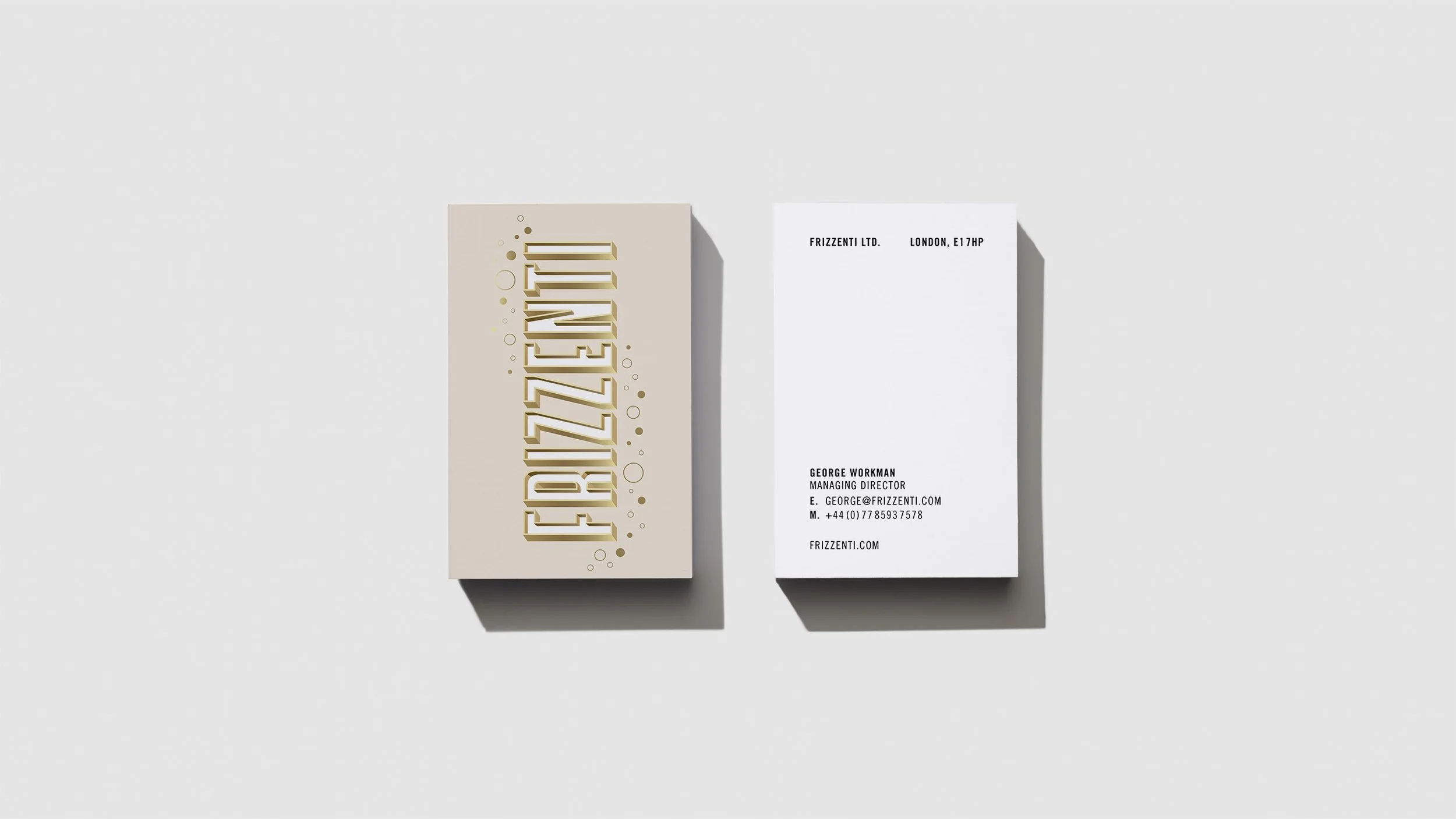
When it’s time to pop open the sparkling, you want a name on the tip of your tongue. So we placed Frizzenti’s name in the spotlight, at the heart of the occasion with a bold vertical wordmark. The 3D details and shadows elevate its striking visual presence. Lettering artist Rachel Joy Price was commissioned to create the initial letterforms, and we crafted the finishing touch.
The colour palette for each variant has been picked to subtly evoke the liquid inside, ensure impact on-shelf, and with an added touch of shimmering gold, capture the quality and sparkle.
Playful graphic bubbles rise from the base of the can to nestle around the lettering. Immediately we know, this is a sparkling tipple.
With more variants in the pipeline, the flexible design system allows for still wine and Prosecco-based cocktails to join the line-up, and for a striking, single-minded brand world to develop as the brand grows.
The launch range features two varietals in 200ml cans: a white “Secco Fizz” at 11% ABV and a pink “Rosato Fizz” at 13% ABV. The playful fusion of a matte finish with a metallic shimmer feels chic, inviting and delicious.
“Popp has given Frizzenti an eye-catching design that clearly communicates the quality and effervescence of the liquid with a feeling of Italian style. Popp’s design packs a punch on a supermarket shelf or in an Instagram feed, with its on-trend style and subtle finish.”
George Workman, Managing Director and Co-Founder
Want to get your spark back?
We can give you a design that shines.